The North Face Digital Brand Redesign
We partnered with our UX researcher to test over 1,000 users via usertesting.com, refining our approach to gather meaningful visual design feedback. We conducted A/B tests both on usertesting.com and live on our site using Monetate, ensuring millions of impressions without impacting conversion rates.
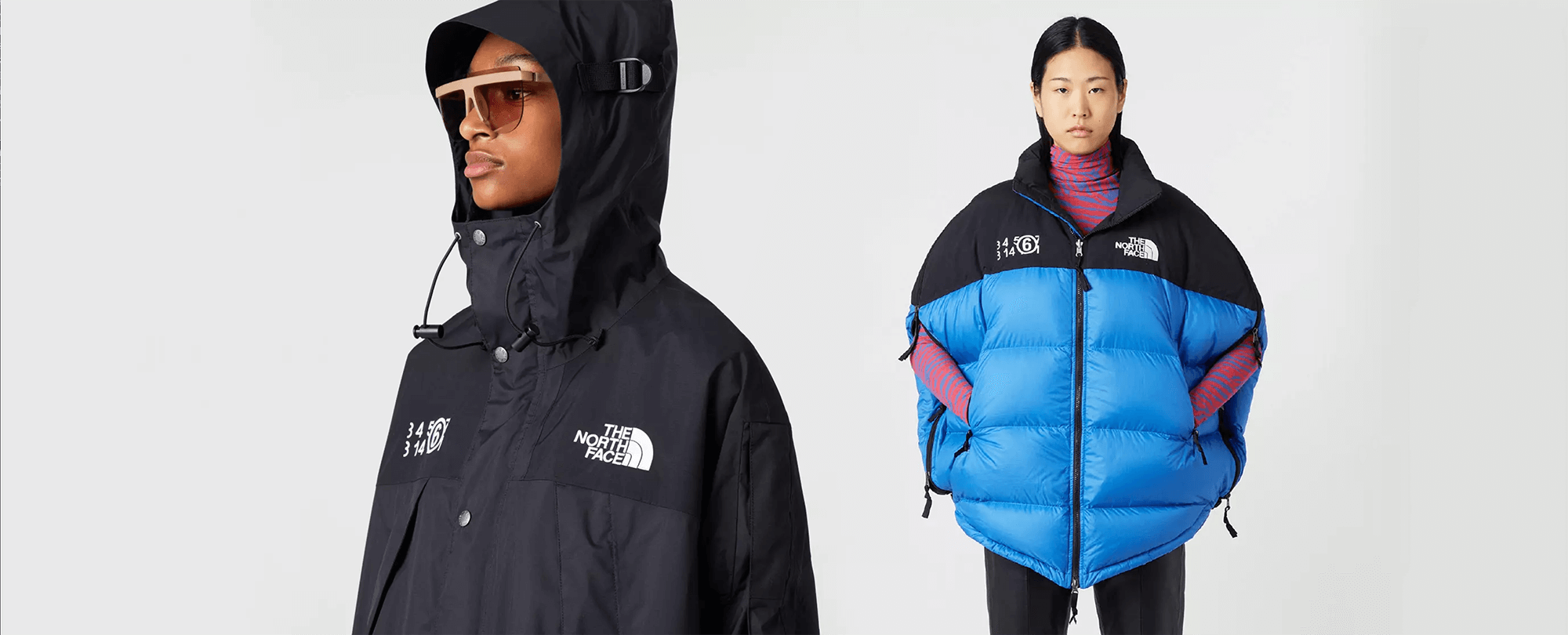
Insights included a surprising lift in revenue after removing review stars from product cards. In a blind perception test, users consistently rated the new designs as more premium—even mistaking unbranded products for higher-end competitors—confirming a positive shift in perceived value and brand perception.
Research
We began the project with extensive stakeholder interviews across the entire organization to identify pain points with the existing site design from merchandisers, developers, designers, and leadership among others. Using this information we created an affinity map to document all the feedback.

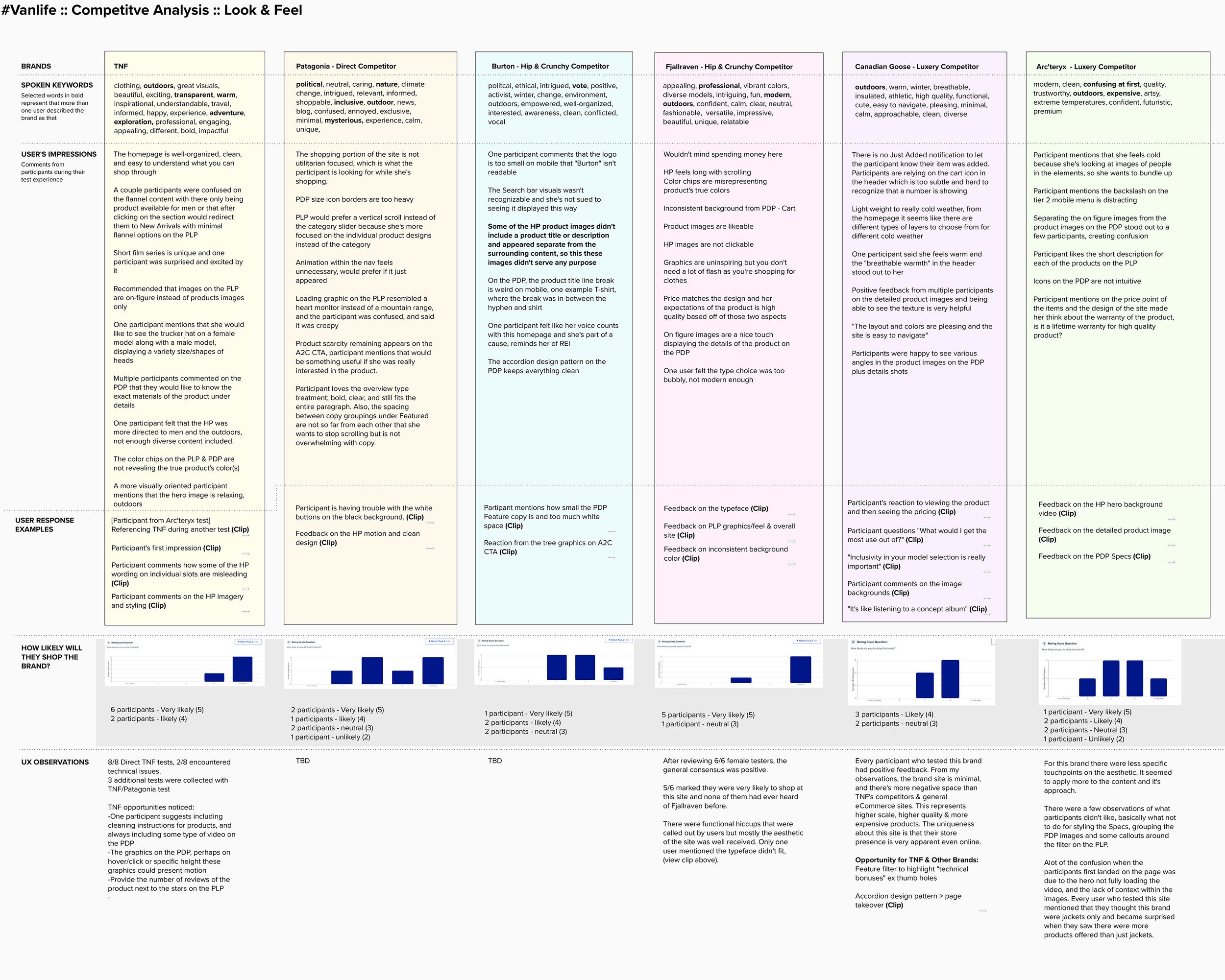
Competitive Analysis
We also conducted extensive competitive analysis of brands brands across the outdoor industry for a comparison baseline.
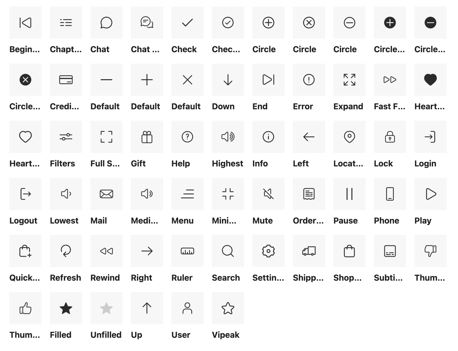
Iconography
To create a more consistent and elevated visual design, we developed a new icon set from scratch. The existing TNF icons were pulled from various sources, resulting in mismatched styles, inconsistent sizing, and a lack of cohesion. Through exploration and feedback from both users and the brand, we landed on a unified outline style with subtle roundness, aligning with the desired elevated look and feel.
Typography
While maintaining Helvetica to preserve brand heritage, we rethought its usage across the site to soften the overall tone. All-caps typography and heavy weights contributed to a sharp, overly masculine feel, as noted in user interviews. We reduced all-caps usage in headlines and UI elements and limited the boldest weight to Helvetica Medium (500), creating a more balanced, approachable, and inclusive visual tone.

Home Page Redesign
While much of this project focused on visual updates, we used the homepage as an opportunity to improve functionality. CMS authors needed more flexible, modular components to better support brand storytelling and promotional moments. We addressed this by introducing new building blocks with improved spacing, layout variation, and visual impact—creating a more engaging first impression while maintaining reusability across the brand.

Interior Page Updates
Beyond the homepage, it was essential to extend visual updates sitewide to maintain consistency. I focused on key pages and user flows, testing with users to validate our approach. While functional changes were out of scope, I improved typography, spacing, and color usage for a cleaner, more modern look. All major updates were A/B tested to ensure no negative impact on conversion.
While a full UX overhaul was out of scope, we applied the updated pattern library to refresh the visual design. This facelift elevated the perceived product value in user testing and delivered a more premium experience aligned with the brand.
PDP Updates
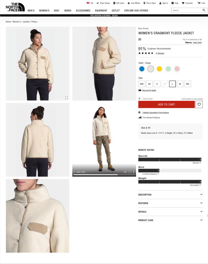
Previous version
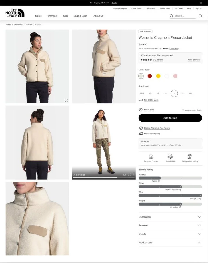
Updated
Cart Update
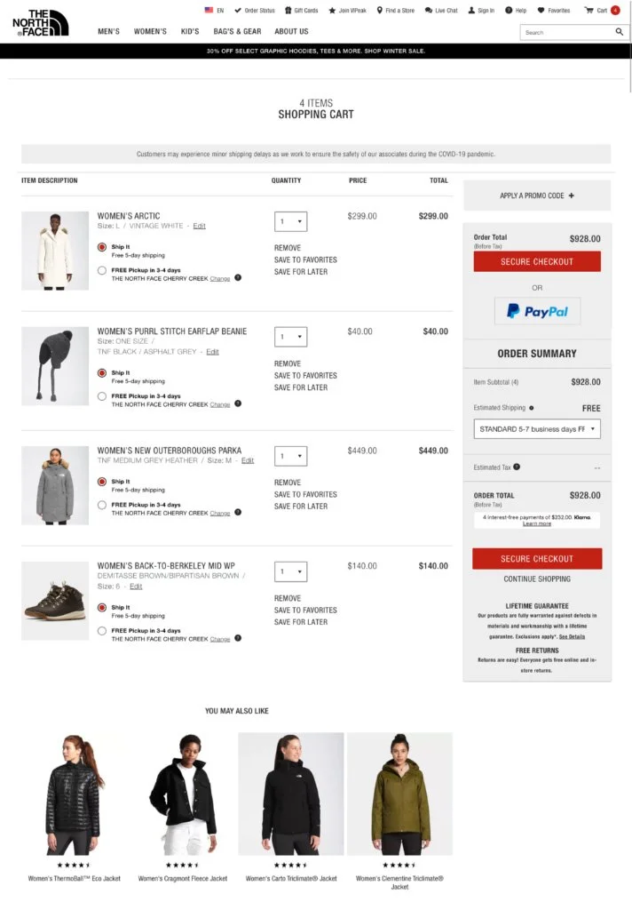
Previous Version
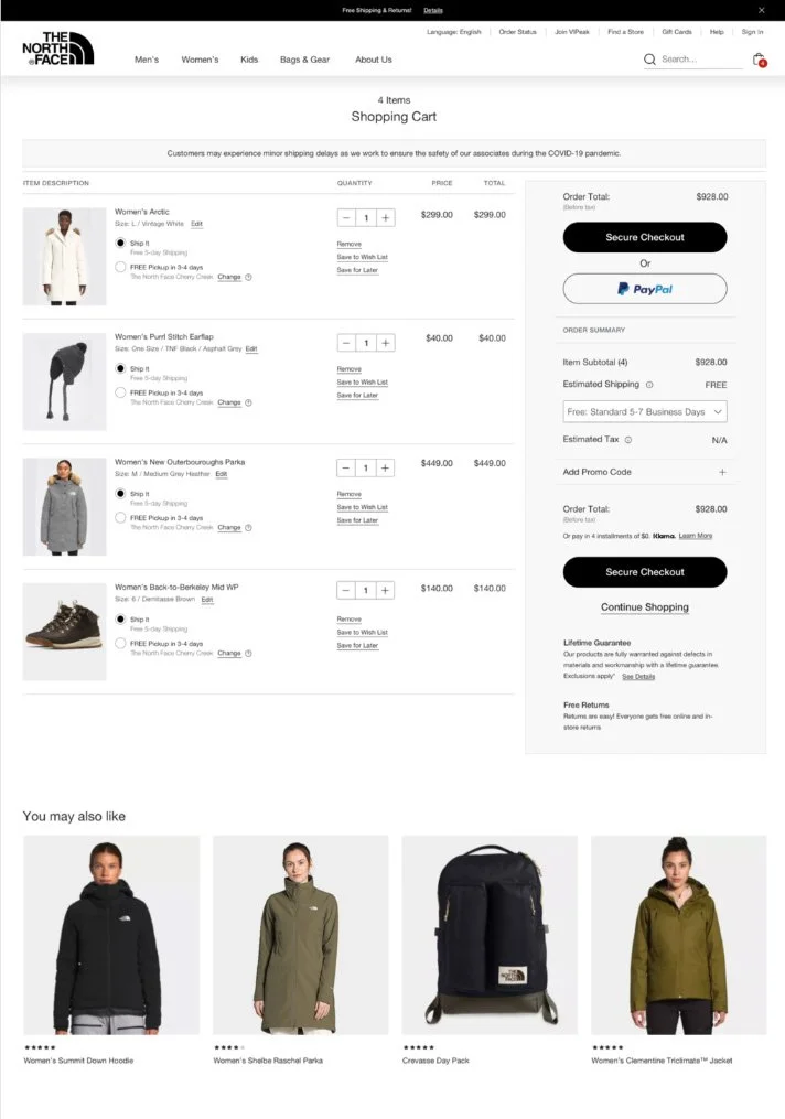
Updated UI
PLP Filter Update
Previous Version

Updated UI
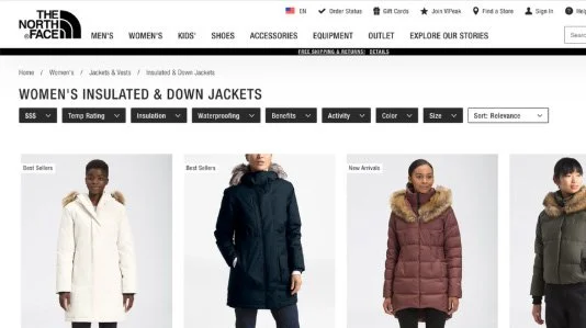
PLP Update
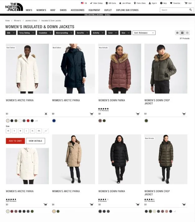
Previous Version

Updated UI
User Testing and Validation
Throughout the design process, we worked with our UX researcher to test over 1,000 users on usertesting.com to make sure we were on the right path. Testing visual design is hard, but we found good methods to get useful feedback. We ran several A/B tests on usertesting.com and also used Monetate to test on our live site with millions of views, ensuring no drop in conversion rates.
We found some surprising results—for example, removing the review stars on product cards slightly increased conversions and revenue. We also ran a blind user perception test by removing The North Face logo and product branding, then asked users to guess the price and brand. This showed that the new designs were seen as higher value, with users often imagining more expensive brands. Overall, the new designs had a positive effect on perceived price and brand perception.